Art Deco: midnight, gold, and symmetry
Art Deco interface design: stepped geometry, strong symmetry, metallic accents, refined display type. Generate the ceremonial style with a ChromaBrew preset.
The interface as a gilded hall
Art Deco draws from the 1920s: stepped and fan-shaped geometry, strong symmetry, metallic gold accents and refined display serifs. Used digitally it reads ceremonial and precise — luxury brands, galas, ticketing and heritage properties reach for it to say 'this is an occasion'.
Recognize it by restraint and symmetry: a dark jewel-toned base, gold or brass doing all the metallic work, stepped lines echoing architecture, and centered, confident compositions. Every trait depends on the others; gold without symmetry is just expensive-looking, and symmetry without gold is plain brown.
The style works because it imports a complete visual culture rather than one trick. The cinematic feel comes from the same moves a great venue makes: a dim room, one warm light source, and details that reward walking closer. In an interface, that translates to a deep dark base, a single metallic voice, and hairline ornament appearing exactly where the eye lands next.
How to recognize it
Ceremonial interfaces share four reliable markers of the Deco grammar:
- Stepped geometry — zigzag, fan and sunburst motifs echo buildings and skyscrapers, not icons
- Strong symmetry — centered compositions and mirrored panels; the layout is ceremonial, never tossed
- Metallic accent — gold or brass does all the highlight work; nothing else is allowed to sparkle
- Refined display type — an elegant serif with deep contrasts, engraved or italic, never chunky
The Art Deco preset
The preset sets a midnight navy as the base — dark enough for the gold to glow — keeps the family analogous so the navy stays deep and rich, uses a refined editorial serif and a generous ratio for that ceremonial display scale, sharpens the radius to fit stepped geometry, and locks the dark background to solid black. A tiny brightness lift keeps the navy from crushing.
Notice what the preset leaves out: a secondary. Art Deco demands one material point of light, and the gold accent is it. Adding a second loud support hue fractures the ceremony. If the system feels like it wants another color, spend it on a deeper navy or a champagne white for paper surfaces rather than a second voice.
Tip
Gold on midnight is beautiful but universally tight on contrast. Where gold carries text, tune it down into a softer champagne tone; keep pure gold for linework and ornaments, and put text on navy or white instead.
How the color roles land in this style
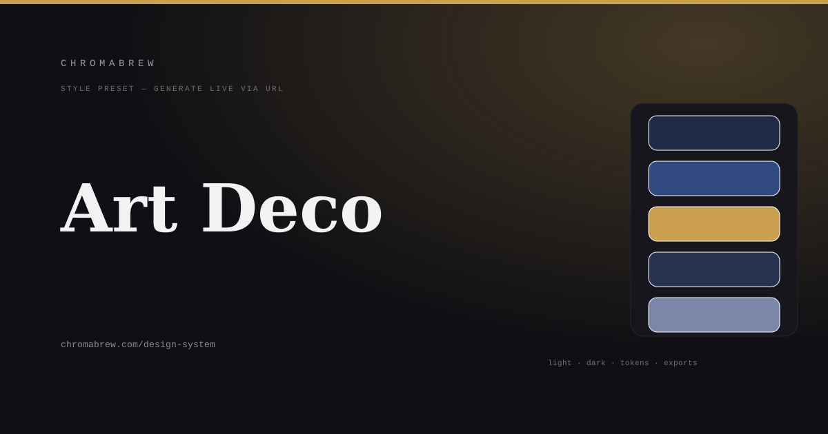
The token ladder becomes an evening palette: the navy background and the slightly lighter surface carry the room; primary is the steel-navy body of chrome; accent is the gold reserved for linework, an active state and one call to action; and the foreground is a warm champagne white that keeps text reading above luxury:
:root {
  --background: #1f2a44;
  --surface: #26324f;
  --primary: #314a80;
  --accent: #caa04f;
  --foreground: #e8e4d8;
}
Adapt it
Swap the navy for emerald, burgundy, or royal purple and the ceremony survives; keep the gold accent regardless, since it is doing the metallic identity. The dark theme should be the default here — open the previews in dark mode first, then make sure the light theme isn't an afterthought.
For a light theme, think 'gallery catalog': ivory surfaces, the same gold doing fine rule lines and small labels, and navy promoted to the ink. Symmetry and the serif carry the identity across both modes; what changes is only where the dark sits. One light pass with those ideas keeps the light theme a member of the family.
Related free tools
Want to apply this right now? Open the color palette generator and try it with your own brand color — free, no sign-up.