Color & design system guides
Practical, no-fluff writing on accessible color palettes, design tokens, Tailwind v4 themes and dark mode — every guide ties back to a free ChromaBrew tool so you can apply it immediately.
Design systems
- Design systems
How to build a color palette for a SaaS dashboard
Dashboards stress-test color harder than any other UI. Here's how to build a SaaS palette that survives dense data, status colors and dark mode.
saasdashboardcolor palettedesign tokensdata visualization - Design systems
How to build an accessible color palette (2026 guide)
Stop guessing at color combos. Here's how to turn one brand color into a full accessible palette that passes WCAG AA and AAA.
accessibilitywcagpalettedesign tokens - Design systems
Dark mode the right way: don't just invert your colors
Dark mode isn't light mode with darker colors. Here's the semantic-token approach that actually looks good and passes contrast.
dark modedesign tokensaccessibilitytheming - Design systems
Build a typography scale that actually keeps its rhythm
A type scale is more than a list of font sizes. Here's how to build one with a ratio, pair it well, and keep vertical rhythm across breakpoints.
typographytype scaledesign tokensui - Design systems
One color to a working design system
Pick a color, and in one session have a design system that ships: scales, tokens, dark mode, a contrast pass, and exports your engineers can actually use.
design systemdesign tokensfigmaworkflow - Design systems
Secondary and accent colors in a design system: what they're for
Primary color gets the credit, but secondary and accent colors carry the hierarchy. Here's what each is for and how to choose them without breaking your palette.
design systemsecondary coloraccent colorcolor rolespalette
Color theory
- Color theory
HEX vs HSL vs OKLCH: which color space should you use?
Three color spaces, three jobs. Here's what HEX, HSL and OKLCH actually are and when each earns its place.
hexhsloklchcssdesign tokens - Color theory
Mix colors and use alpha without ruining your palette
Blending colors and adding transparency seem easy — until they turn your palette to mud. Here's the alpha-aware way to do both.
color mixingalphaopacitytransparency  Color theory
Famous brand colour palettes: exact hex values and how to use them
Spotify green, Stripe indigo, Netflix red — exact brand hex values plus a workflow for turning any brand colour into an accessible design system.
brand colorsbrand colour paletteshex valuescolor palettedesign system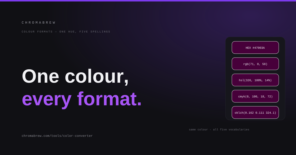 Color theory
HEX, RGB, HSL and CMYK: which colour format should you use?
Four formats, one colour. When to write hex, when to reach for HSL, why CMYK only matters for print, and why OKLCH beats all of them for scaling colours.
hexrgbhslcmykoklchcolor convertercolor format
Development
- Development
Generate a Tailwind v4 color scale from one color
One brand color → a complete Tailwind v4 50–950 scale as a @theme block. Here's how, and why the steps stay perceptually even.
tailwindcssthemecolor scale - Development
SVG vs JPG: when to use which (and how to convert)
Vector or raster? A practical breakdown of SVG vs JPG and how to convert between them without losing your sanity.
svgjpgimageconversion 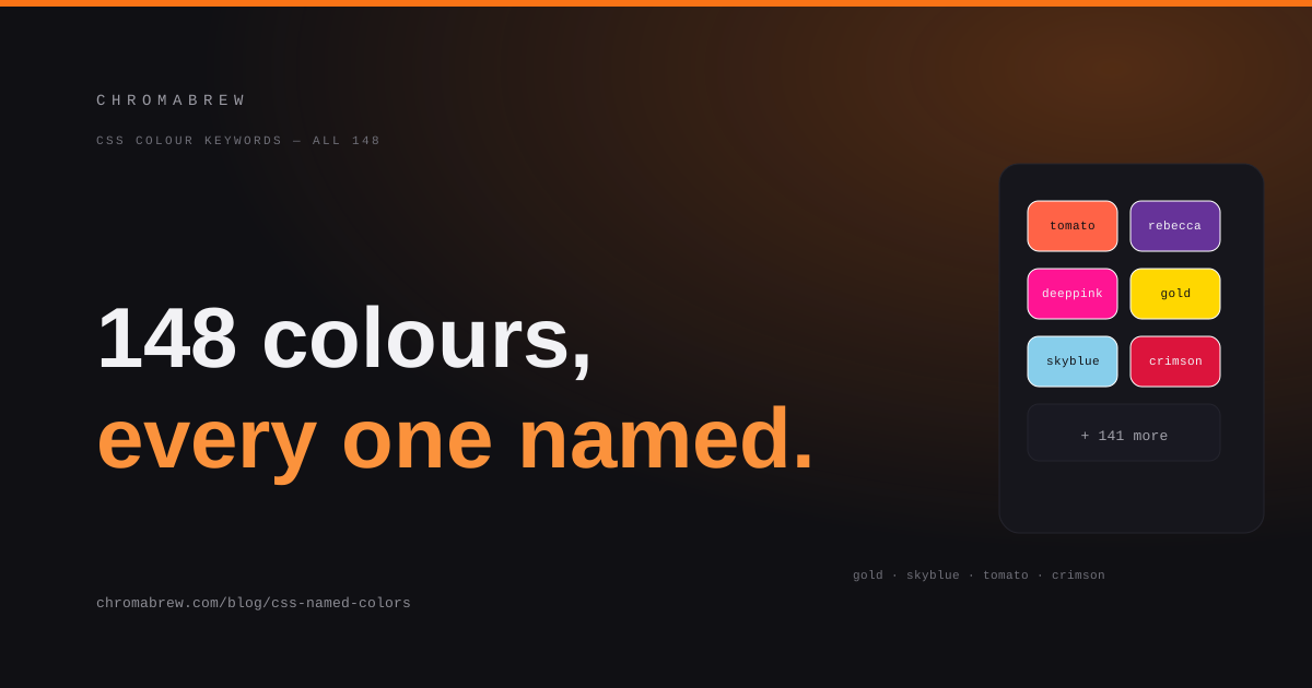 Development
CSS named colors: the full list of 148 and when to use them
tomato, rebeccapurple, deeppink — 148 CSS color names exist and most are unforgettable in the wrong way. When to use them, when not to, and how to find the nearest one.
css named colorscss color namescssweb developmentcolor
Short lessons
- Short lessons
Turn a photo into a working color palette
Your brand color might already be hiding in a photo you love. Here's how to pull a palette from any image.
imagepalette - Short lessons
Shadows that suggest elevation, not blur
A good shadow is layered, directional and subtle. Here's the elevation recipe most UIs are missing.
shadowelevationui - Short lessons
Gradients that don't look cheap
Most gradients look muddy because both stops are too similar. Here's what actually makes a gradient read as rich.
gradientcsscolor - Short lessons
Free AI images using an AI coding tool + SVG
You can get genuinely free AI images: ask a coding assistant to write SVG, then convert it to JPG. Here's the workflow and its honest limits.
svgaiimagesworkflow
Design styles
 Design styles
Fourteen design system styles you can generate with one link
A visual style is just a set of structural settings. Here are fourteen of them, encoded as generator links that build the entire system — not just a screenshot.
design systemvisual stylespresetstheming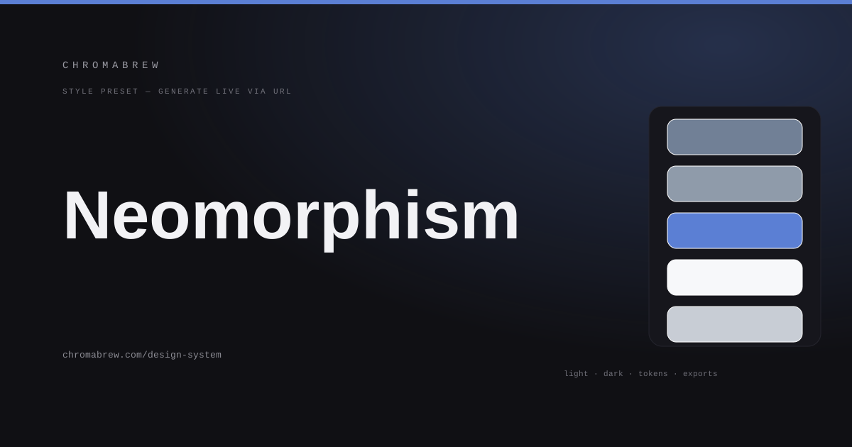 Design styles
Neomorphism: a design system that feels carved out of one surface
Soft, extruded controls, paired shadows, one material surface. Here's the neomorphism design system preset — and the contrast rules it needs to survive.
neomorphismsoft uidesign systemshadows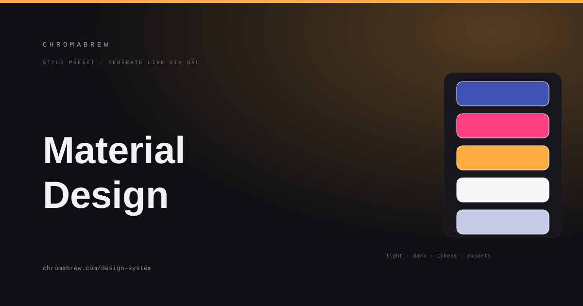 Design styles
The Material design system: bold color roles on elevated surfaces
Elevation, color roles, clear states — Material's ideas, applied through the generator. Here's the preset and how to bend it to a brand.
material designdesign systemelevationtokens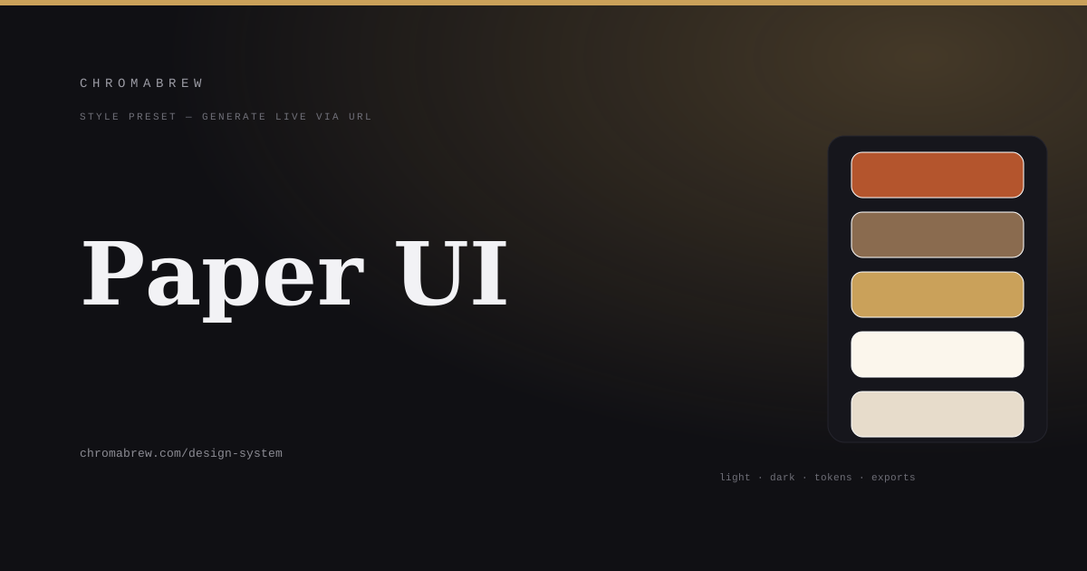 Design styles
Paper UI: a design system built from warm stock and ink
Warm paper, ink text, ruled details. The paper UI style reads like print — here's how to generate the system and keep the ink readable.
paper uieditorialdesign systemwarm palette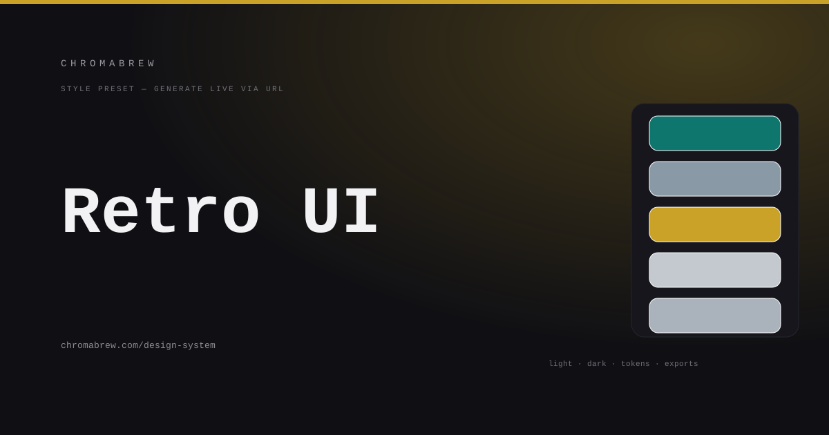 Design styles
Retro UI: the 90s desktop as a design system
Beveled buttons, steel teal-grey, window chrome. Here's the retro 90s-desktop style as a working design system preset.
retro ui90s desktopdesign systemnostalgia Design styles
Bento grid: a design system built from modular tiles
The bento grid is a layout discipline and a color discipline. Here's the preset that keeps varied tiles feeling like one system.
bento griddashboarddesign systemmodular layout Design styles
Terminal UI: a design system for the keyboard crowd
Monospace, command-first, all-dark. Here's the terminal UI style as a design system you can generate — and keep readable.
terminal uimonospacedark modedeveloper tools Design styles
Skeuomorphism: a design system that feels like real materials
Wood, leather, brass — skeuomorphism makes digital controls feel physical. Here's how to generate the material style and keep it from looking like a museum.
skeuomorphismmaterialsdesign systemdepth Design styles
Claymorphism: soft, inflated, playful
Inflated cards, saturated pastels, directional shadows. Here's the claymorphism style as a design system — and where its contrast gets fragile.
claymorphismpastelsdesign systemplayful ui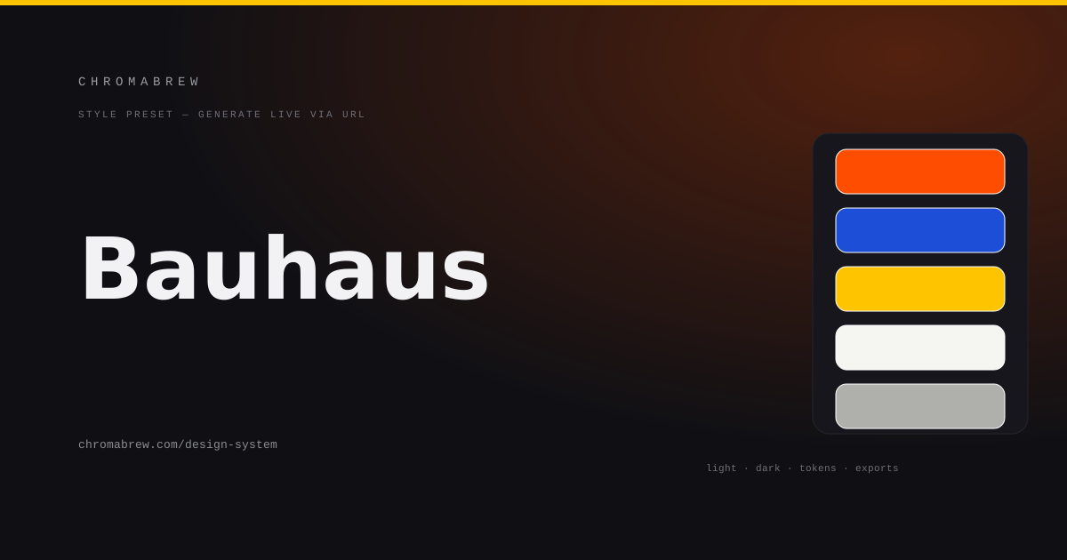 Design styles
Bauhaus: primary geometry, bold type, hard edges
Red, blue, yellow, geometry. The Bauhaus approach to interface design is discipline disguised as play — here's the preset.
bauhausgeometricdesign systemavant-garde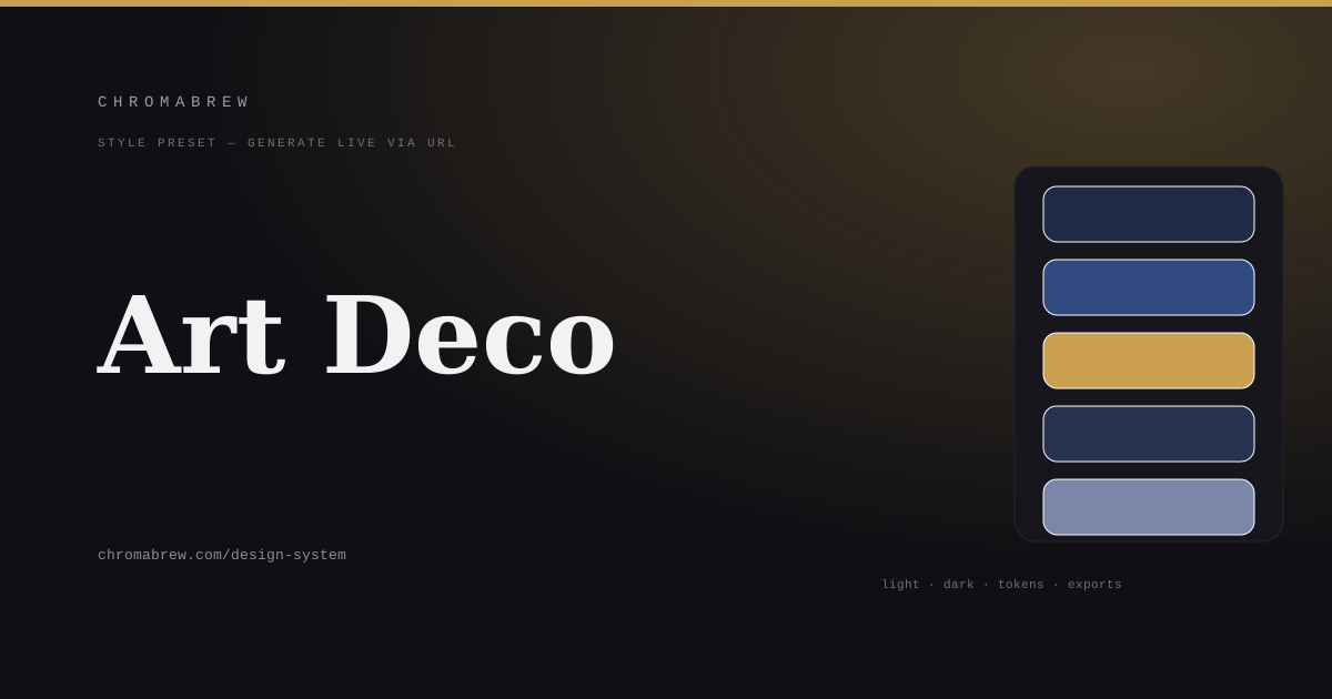 Design styles
Art Deco: midnight, gold, and symmetry
Midnight navy, gold linework, symmetry. The Art Deco style turns an interface into a ceremony — here's the preset.
art decogolddesign systemluxury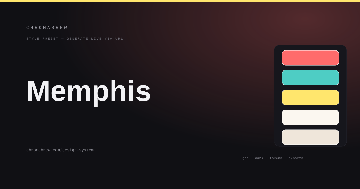 Design styles
Memphis: postmodern geometry and deliberate imbalance
Dots, squiggles, loud triads. The Memphis style is play with a point — here's the design system preset with its restraint built in.
memphispostmoderndesign systemplayful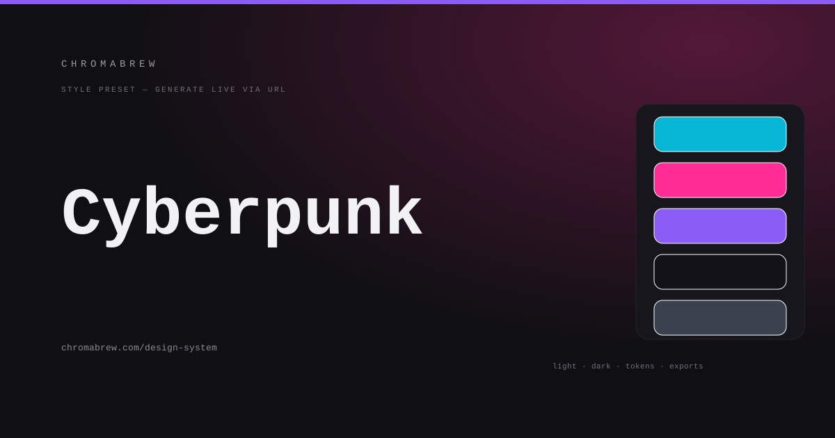 Design styles
Cyberpunk interface: dark, luminous, technical
Cyan and magenta on near-black, angular panels, dense labels. Here's the cyberpunk interface style as a working design system.
cyberpunkdark modeneondesign system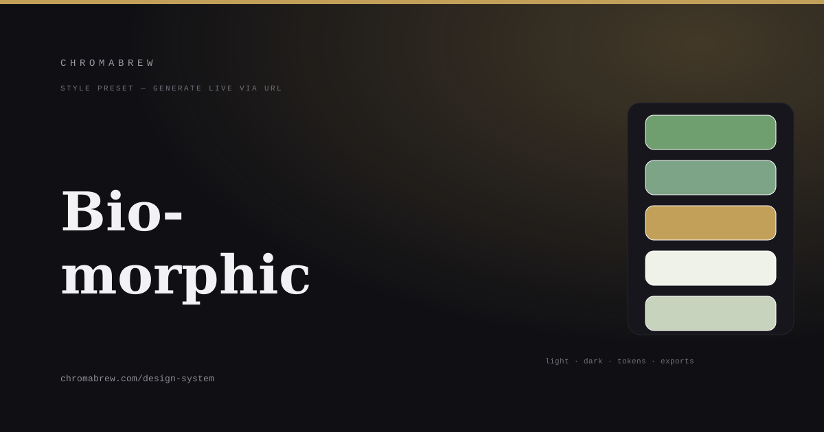 Design styles
Biomorphic: organic shapes and earth colors
Leaf forms, flowing edges, sage and clay. The biomorphic style softens the grid — here's the design system preset and its limits.
biomorphicorganicdesign systemnatural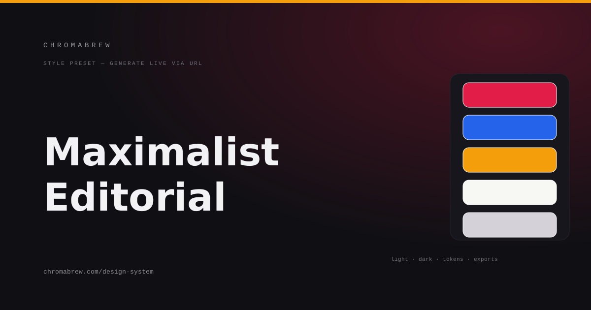 Design styles
Maximalist editorial: type as the loudest element
Oversized headlines, layered type, color blocks. The maximalist editorial style makes hierarchy the experience — here's the preset.
maximalisteditorialtypographydesign system
Accessibility
33 guides published. Explore all free color tools →