Maximalist editorial: type as the loudest element
Maximalist editorial interface design: dramatic scale, layered typography, dense rhythm, vivid color blocks. Generate the bold style with a ChromaBrew preset.
When hierarchy is the content
Maximalist editorial turns the hierarchy itself into the experience: oversized headlines that dominate the viewport, layered and overlapping typography, dense rhythmic layouts, and vivid color blocks slammed against each other. It's magazine energy — culture brands, media companies and loud portfolios use it to feel alive and opinionated.
Recognize it by scale and density: dramatic type that breaks the grid, nested layers of text and shape, tight editorial rhythm where every inch is doing something, and color blocks used with confidence. The hidden rule is that drama needs a reference point — a layer of calm text and whitespace underneath is what makes the loud parts loud.
The style descends from poster and magazine masthead design, where a single page fought for one second of attention. That heritage is why it works online: the web is an attention auction, and an editorial interface makes its bid with scale rather than noise. The professional executions exercise restraint precisely where amateurs don't — loud everywhere is not maximalism, it is spam for the eyes.
How to recognize it
Four qualities separate a designed maximalist editorial system from a cluttered page:
- Dramatic scale — one or two type sizes tower over everything else; the headline owns the viewport
- Layered composition — text blocks overlap and cross the grid with purpose, never by accident
- Dense rhythm — small holdings, rules and labels fill the space; nothing sits lonely
- Confident color blocks — one or two full-strength slabs at a time, placed hard against the grid
The maximalist editorial preset
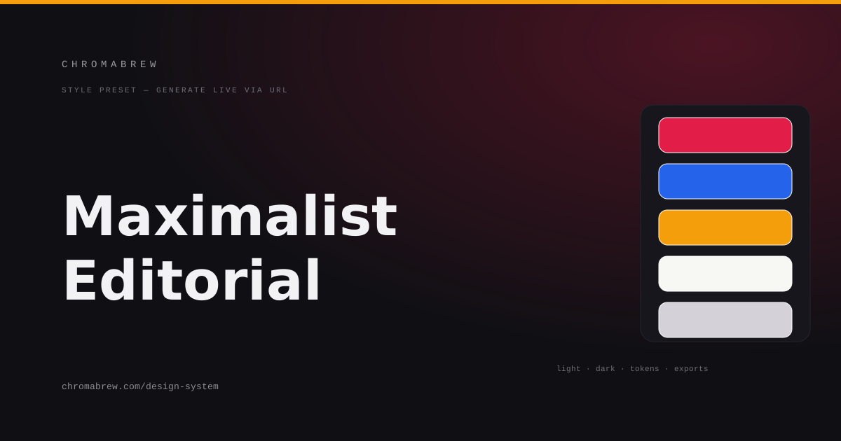
The preset sets a vivid crimson as the master headline hue, a strong blue and an amber for the block-and-accent work, keeps the family related through split-complementary strategy, sharpens the radius so color blocks land as hard slabs, and pairs an editorial serif with the most generous type ratio in the generator — because this style is nearly all type.
Split-complementary earns its place here by keeping the crimson master and its two assistants on speaking terms: blue sits a real distance away for block contrast, while amber nests near the crimson so it can read as a highlight that belongs to the same story. The visible hierarchy — one hue clearly in charge — is the entire discipline of the style.
Tip
Layered type over color blocks is where reading collapses. Give headlines a legible background or real contrast step, keep body text on solid light surfaces, and let one hue dominate while the other two stay accents — three full-strength blocks at once is noise.
How the color roles land in this style
The roles here are ninety percent dosage. The crimson primary takes the master headline and the one hero block; the blue secondary owns the second-tier blocks and structural rules; the amber accent marks small metadata and the single live call to action; and everything else stays on white or near-white so the loud parts can be loud. One master hue, two helpers, a plain ground:
:root {
  --background: #ffffff;
  --surface: #f7f7f3;
  --primary: #e11d48;
  --secondary: #2563eb;
  --accent: #f59e0b;
  --foreground: #17171a;
}
Adapt it
Any crimson-family brand works; the anchoring move is keeping the dominant hue dominant. Use the marketing preview to judge headline scale, the SaaS preview to confirm the density stays usable in a working tool, and the generous ratio across all four — then shave the palette down rather than up if the previews feel frantic.
Keep the scale strategy explicit in the tokens. With a 1.333 ratio, the jump from body to display is enormous — and that is the point — but it only holds if body copy stays small, quiet and mechanically readable. The moment body type starts shouting, the style reads as chaos instead of hierarchy. Calm text is not a compromise here; it is the mechanism.
Related free tools
Want to apply this right now? Open the color palette generator and try it with your own brand color — free, no sign-up.