Memphis: postmodern geometry and deliberate imbalance
Memphis-style interface design: playful geometry, pattern mixing, bright accents. Generate the postmodern style with a ChromaBrew preset.
Playfulness with a grid underneath
Memphis launched as a rebellion against minimalism in the eighties: squiggles, dots, confetti and loud color clashing on purpose. As an interface language it's youthful and expressive — creative studios, events and content products use it to say 'not corporate', often paired with a straight-laced layout underneath so the play has structure.
Recognize it by tone and tension: playful geometry and pattern mixing, bright accent colors against a plain base, and a casual imbalance that never reads as careless. The serious part is the foundation — a Memphis system is disciplined layout wearing colorful sunglasses, and the restraint is what keeps it from becoming noise.
The group's own label for it — 'a cocktail of everything' — is the honest description. Memphis mixes pattern languages freely, but the reason it still looks designed rather than broken is a plain grid underneath and a rule that only one loud thing speaks per square. Replicate those two rules and you can be as bold as you like.
How to recognize it
Memphis is instantly legible, and four cues mark the real thing:
- Playful geometry — squiggles, dots, confetti and loose shapes mixed into layouts that are otherwise orderly
- Pattern mixing — grids, stripes and scattered marks layered on the same surface without apology
- Loud triads — three saturated accents clashing on purpose, evenly spaced so the clash reads as intended
- A plain base — a quiet, usually white or cream ground that makes every color look louder than it is
The Memphis preset
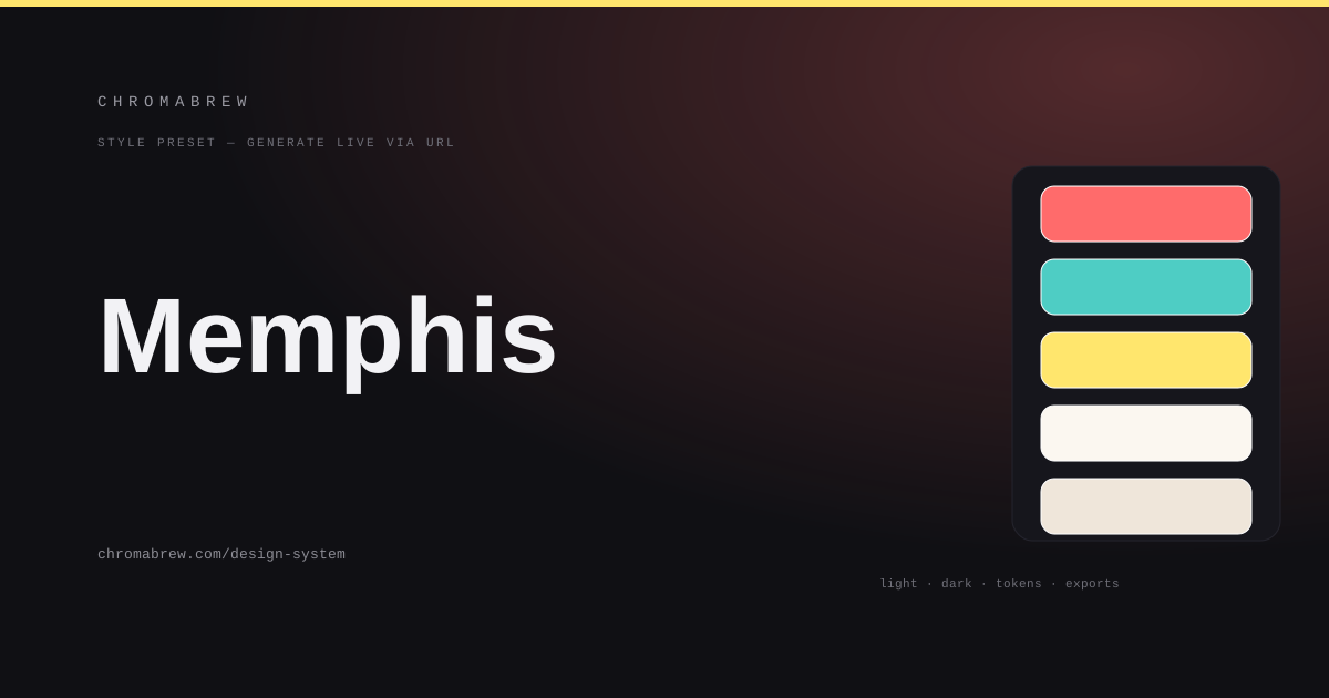
The preset picks a loud coral-teal-yellow triad — evenly spaced hues so the clashing reads as intentional — rounds the radius to match the doodle energy, uses a grotesque pairing for bold attitude, and pushes saturation up the way the movement demands.
The evenly spaced triad is the quiet engineering Easter egg. Place any three hues 120° apart and they keep their identities while still vibrating against each other. Memphis wants that vibration, but it wants it to feel chosen — which is exactly what an even split delivers. Keep any replacement triad evenly separated and the same deliberate clang survives.
Tip
A triad this loud makes text its own casualty. Design a neutral base into the system and let one hue at a time carry color — the moment all three saturate the same screen, contrast and calm both leave.
How the color roles land in this style
Roles in Memphis are a matter of dosage, not hue semantics — every token stays loud, they just never appear at once. Primary carries the featured action, secondary the doodle-pop of the hero, accent the small confetti moments, and the surfaces stay plain so the saturation looks higher than it is. The discipline is literal: one hue per element, never one element wearing all three hues:
:root {
  --background: #ffffff;
  --surface: #fbf7f0;
  --primary: #ff6b6b;
  --secondary: #4ecdc4;
  --accent: #ffe66d;
  --foreground: #241f20;
}
Adapt it
Any bright triad you love works — just keep the three hues evenly separated so they keep that deliberate clang. Let the previews place color sparingly: primary for the featured action, accent for the doodles, and the neutral surfaces doing the heavy lifting. Check text pairs after every hue swap.
And run the color-blindness check twice, because loud reds and greens are the exact pairing that vanishes for many users. If icons and doodles carry meaning on their own, great; if color is doing semantic work, add a pattern or a shape cue — which Memphis tolerates beautifully, since patterns are native to it.
Related free tools
Want to apply this right now? Open the color palette generator and try it with your own brand color — free, no sign-up.