Retro UI: the 90s desktop as a design system
Retro UI explained: beveled chrome, window metaphors, compact density, a limited teal-grey palette. Generate the nostalgic style with a ChromaBrew preset.
Windows you remember, not the ones you have
Retro UI reaches for the early desktop metaphor: beveled window chrome, chunky controls with highlight-and-shadow edges, compact toolbars, and a disciplined teal-grey palette. It reads as deliberately nostalgic — project management tools, developer utilities, and anything playing up its own earnestness use it to signal a simpler, more solid era.
Recognize it by chrome and restraint: beveled, dimensional controls; dense, compact layout; window metaphors like title bars, panes and status bars; and a limited palette where no more than two or three hues exist at all. The constraint is the charm — this style quietly dies the moment you add a modern rainbow accent wave.
Nostalgia works because it's specific. The teal-and-grey of a mid-nineties desktop is instantly recognizable to an entire generation, and the reference does the emotional work an interface usually has to do itself. It's also why vague 'vintage' attempts fail: the palette has to be an actual period-correct palette, not today's colors wearing a slight filter.
How to recognize it
The 90s desktop look has a short, strict set of tells:
- Bevels everywhere — controls are built from a light top edge and a dark bottom edge; no glow, no gradient washes
- Window metaphors — title bars, panes, tab strips and status bars act as real furniture
- Dense but ordered — compact 8px-ish rhythm and small type, yet legible because contrast stays high
- A tiny palette — one or two hues plus neutrals; three hues at most, always muted
The retro UI preset
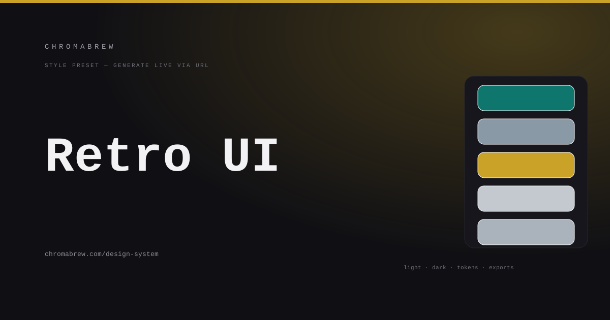
The preset stays true to the era: a utilitarian teal, a steel grey for chrome, a restrained brass gold for the rare highlight, split-complementary so the teal has one real opponent, sharp radius for crisp bevels, and saturation dialed down so nothing glows. System fonts keep the terminal-office authenticity.
A caveat worth knowing: the generator's previews are modern components — soft buttons, card grids, hero sections. Retro is a surface treatment more than a component set, so the bevel language and compact density are what you bring. The preset gets the color and shape language right; the chrome details are your finishing move.
Tip
Bevels imply depth; they also demand contrast. Make sure beveled buttons stay clearly distinguishable from beveled inputs — same chamfer, opposite affordance confuses people — and give disabled chrome a real state difference, not just a grey tint.
How the color roles land in this style
The roles stay modern even when the chrome doesn't. Primary is the action teal; secondary is the steel grey that builds chrome and inactive states; accent is the brass that only touches one highlighted item per screen; and the surfaces stay light steel so the bevels can read. Everything sits in a low-saturation range so the whole screen holds together like one window manager:
:root {
  --background: #d9dde1;
  --surface: #c3c9cf;
  --primary: #0f766e;
  --secondary: #8a99a6;
  --accent: #c9a227;
  --foreground: #1c2733;
}
Adapt it
If the teal isn't yours, any period-correct industrial hue (battleship blue, café orange, sage) drops in — keep sat low and let the steel grey carry the chrome. Add compact density to the four previews by treating the marketing preview as the one page that gets to relax; the desktop feel belongs in the SaaS and mobile tools.
Watch the dark theme like a hawk here. A beveled light desktop is the icon of the style, and a flipped-on-black version can silently forget the highlights that make bevels bevels. Give your dark mode a steel-grey tint rather than pure black, keep the highlight/shadow pairing intact, and make sites and backgrounds lighter than the window frame, not darker.
Related free tools
Want to apply this right now? Open the color palette generator and try it with your own brand color — free, no sign-up.