The Material design system: bold color roles on elevated surfaces
What makes a Material-style design system tick: elevation, color roles, clear states. Plus a ChromaBrew preset that generates a Material-inspired theme from three hues.
The ideas, not the widgets
Material Design gets remembered for its widgets, but its real contribution is structural: surfaces sit at different elevations, color has defined roles, and states are explicit. A card is a raised surface, a dialog floats higher, and each step of elevation is communicated by shadow and surface lightness rather than a border. Color roles — primary, secondary, accent, surface, error — do the communicating.
Recognize a genuine Material-derived system by elevation and role discipline: layered surfaces, a bold primary family doing the action work, a supporting hue for secondary interactions, and clear hover/pressed/disabled states on everything. It's the default grid-walking visual language of the last decade for a reason.
That discipline is older than Material and outlives it. The team took years of desktop and web conventions — shadow equals depth, emphasis equals color — and codified them into tokens anyone can copy. The same grammar is exactly what the generator's four previews use, which is why Material-derived palettes drop in with almost no adjustment.
How to recognize it
Material is one of the easiest large styles to identify, because its tells are structural rather than ornamental:
- Elevation everywhere — cards, sheets and dialogs are separated by shadow and surface lightness, not outlines
- Bold primary family — one hue family carries the emphasized actions and the selected states
- Color roles that repeat — primary, secondary, surface, error and on-background: the same grammar on every screen
- Explicit states — hover, pressed, focus and disabled each have a defined treatment on every interactive control
The Material preset
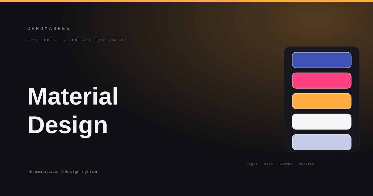
The generator's four previews already think in elevation and color roles, so the preset mostly picks the palette. The classic trio is indigo for primary, a pink for the secondary/support role, and an amber accent for status and highlight. Complementary strategy gives the primary a real opposite hue to work against, radius stays soft, and the dark theme comes free.
You can fight the trio or lean into it. Indigo, pink and amber together read so instantly that the combination alone says 'Material'; swapping in your own primary while keeping the pink and amber roles takes the same look toward 'Material for your brand'. Either way, the elevation does the heavy lifting — the colors are just the wardrobe.
Tip
In a Material-style system the primary belongs to emphasized actions and the secondary to everything one step below. Keep accent coverage small — status, selection, special emphasis — or the hierarchy blurs.
How the color roles land in this style
Material's roles map cleanly onto the token ladder. The base is white or near-white; the primary family carries actions and selected states; the secondary covers supports and emphasis; the accent marks status. Error gets its own reserved hue (a strong red) so it can never be confused with something good:
:root {
  --background: #ffffff;
  --surface: #f5f6f8;
  --primary: #3f51b5;
  --secondary: #ff4081;
  --accent: #ffab40;
  --foreground: #1b1b1f;
}
Bend it toward a brand
Drop your own hue into primary and the system re-derives the family around it; the pink and amber stay only where you want support and status. Then walk the four previews looking for state, not color: every button needs hover, pressed and disabled versions, and every surface needs visible elevation. That's the Material test that screenshots never pass.
The dark theme is where elevation gets its second exam. Shadows are invisible on black, so Material's light-mode shadow cues turn into lightness cues in dark mode — a raised card is simply a lighter surface. Let the generator's tinted dark background do that work rather than forcing a pure black that erases all layering.
Related free tools
Want to apply this right now? Open the color palette generator and try it with your own brand color — free, no sign-up.