Types of color blindness: a practical guide for designers
The eight types of color vision deficiency, how common each one is, how they differ genetically and perceptually, and what that means for your color decisions as a designer.
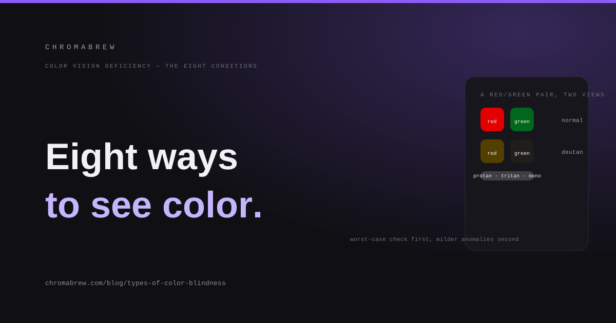
Color vision deficiency, not color blindness
The first correction worth making is vocabulary. Most people with color vision deficiency (CVD) are not blind to color at all — they see color, just differently. True blindness to all color exists, but it is vanishingly rare. The umbrella term is color vision deficiency, and 'color blindness' is the common shorthand that most people actually mean when they talk about it.
CVD is common enough that you design for someone with it every day: roughly 1 in 12 men (about 8%) and 1 in 200 women (about 0.5%) have some form. Because the most common types are carried on the X chromosome, the vast majority of affected people are male. This isn't a niche. It is a normal, permanent part of your audience.
The key idea for the rest of this article is the 'eight conditions': for each of the three cone families there is a full form (no cones of that type) and a milder form (reduced sensitivity), plus the rare total forms. Design against the worst case and the milder cases are covered automatically.
Three cone types, three axes of failure
Typical human color vision is trichromatic: three types of cone cell in the retina respond to short (blue), medium (green) and long (red) wavelengths, and the brain mixes their signals into every color you see. Color vision deficiency happens when one of those cone populations is missing or behaves abnormally.
That gives the natural axes of classification. Problems with the long-wavelength (red) cones are protan; problems with the medium-wavelength (green) cones are deutan; problems with the short-wavelength (blue) cones are tritan. Protan and deutan are both colloquially 'red-green', which is accurate about symptoms but hides that they are separate conditions with different genetics.
The red-green conditions: protan and deutan
Red-green deficiency is by far the most common and is what most people picture. Among men: deuteranomaly (reduced green sensitivity) affects around 4.6%, deuteranopia and protanopia (missing green or red cones) around 1.2–1.3% each, and protanomaly (reduced red sensitivity) around 1%. The anomalies outnumber the full forms, which is why it matters that your design survives the milder cases too — they are the ones most of your users with CVD actually have.
People with protan and deutan conditions both struggle to tell reds apart from greens — a red berry against green foliage vanishes, a red error message against a green success next to it turns into two similar buttons. The difference between the two families shows up in brightness: protans see reds as darker (pure red collapses toward a dark brown-grey), deutans barely change overall brightness. Both are inherited, sex-linked traits: a mother can pass them to her sons, and a father never passes them to his.
The blue-yellow conditions: tritan
Tritan deficiency — tritanopia (no blue cones) and tritanomaly (reduced blue sensitivity) — is much rarer, roughly 0.01% of the population, and behaves differently. It is not concentration on the X chromosome, so it affects men and women about equally, and it can also be acquired later in life by eye disease or some medications, unlike the red-green forms which are present from birth.
With tritan deficiency, blue and yellow pairs collapse: navy text on a near-black background, or yellow status indicators on white. Because it can develop over time, a user in your audience may lose blue-yellow discrimination during the lifetime of your product.
Total color blindness: monochromacy
Monochromacy — complete color blindness, called achromatopsia in its rod-only form — is the rarest and most severe, around 1 in 30,000 people. The world appears in shades of grey, at reduced acuity, and people with achromatopsia are often sensitive to bright light.
It is the only CVD where color genuinely disappears. Everything you make must work in grey for these users — which is a brutal, useful design exercise: if a design reads correctly in greyscale, achromatopsia is handled.
What it means for your color decisions
The habits that protect your users are simple and concrete. Never let color be the only channel: pair any color-coded meaning with a second cue like a label, icon, pattern or position. Remember what 'red-green' actually means: a red/green pair that passes WCAG contrast by lightness alone can still collapse together for a deutan user, because contrast is computed from lightness, not hue.
Then verify with a simulator. Run your prototype or a representative screenshot through every condition — worst case first (full forms), then the milder anomalies — and check that your key pairs stay distinguishable. If two colors in a chart differ only in hue and land below the color-difference threshold after simulation, swap one for a different hue family or add a shape cue. Roughly 8% of men depend on you getting this right.
- deuteranomaly ~4.6%, protanopia/protanomaly ~1.2–1.3% each, deuteranopia ~1.2% of men
- tritanopia and tritanomaly ~0.01%, men and women equally
- achromatopsia ~1 in 30,000 — total loss of color
Tip
Design against the full conditions (the worst case) and the milder anomalous forms are automatically covered. When a pair fails a check, the fix is usually a different hue family plus a non-color cue — not a tiny tweak of the same hue.
Related free tools
Want to apply this right now? Open the color palette generator and try it with your own brand color — free, no sign-up.