Cyberpunk interface: dark, luminous, technical
Cyberpunk interface design: dark high-contrast surfaces, luminous accents, angular frames. Generate the neon future style with a ChromaBrew preset.
Speculative technology, legible enough to use
Cyberpunk interface design imagines technology as dense and slightly hostile: near-black surfaces, luminous cyan and magenta accents, angular frames and panels, and technical microcopy everywhere — speculation numbers, status labels, node graphs. It signals powerful, futuristic utility: analytics tools, AI products and game-adjacent software love it.
Recognize it by contrast and framing: dark high-contrast base, a small set of luminous accents doing real work, sharp angular or clipped panels, and text that reads technical even when it's marketing copy. The discipline is that despite the mood, everything stays readable — a proper cyberpunk system is a dark theme that passes accessibility, not a neon poster.
The genre's actual invention was the interface as a window into a machine, dense with data rather than friendly emptiness. The best cyberpunk products borrow that intensity with a trade: they earn the dense, glowing look through genuinely high information density. If the product is thin, the styling reads as costume; if the product earns its labels, the styling does the work of credibility.
How to recognize it
The neon-future look has four reliable signatures:
- Dark high-contrast base — near-black surfaces with near-white copy; the mood lives in contrast, not in grey
- Luminous accents — cyan and magenta (or one chromatic pair) doing real work: frames, primary action, status
- Angular framing — clipped corners, hard panels and diagonal cuts instead of soft rounded chrome
- Dense technical copy — labels, IDs and status strings that make the UI feel instrumented
The cyberpunk preset
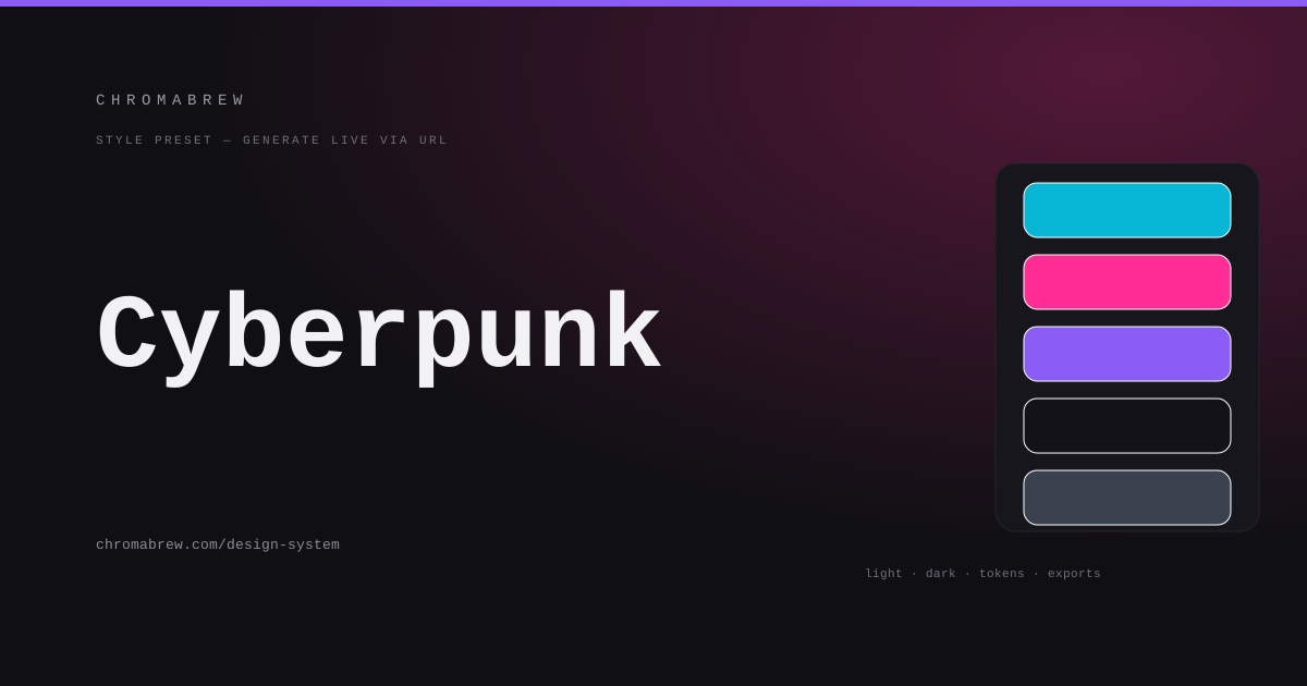
The preset builds the classic trio — cyan primary, magenta secondary, violet accent — as a split-complementary family so the neon hues feel related rather than random, sets sharp radius for the angular panel language, pairs a technical monospace for the dense label mood, locks the dark background to solid black, and pushes saturation up so the accents genuinely glow.
Split-complementary is the right engine here because full complementary (cyan against orange) reads as sports livery, while true analogous hues go muddy and forgettable. Split keeps the cyan family unified with a warm violet as punctuation. If you swap in a different neon pair, keep them separated enough on the wheel that they stay two colors and never merge into one glow.
Tip
Luminous accents sharpen against black, which is exactly when they blow past usable. Body text should never run in cyan or magenta — reserve them for the frames, the primary action and status, and keep copy in the near-whites.
How the color roles land in this style
This is a two-theme system and the roles stay identical in both. The black base carries everything; cyan primary owns frames and the main action; magenta secondary marks the second tier of chrome and warnings; violet accent highlights selection; and body copy lives in near-white, with the accent colors reserved for structure and status rather than for text:
:root {
  --background: #0a0a0c;
  --surface: #121218;
  --primary: #06b6d4;
  --secondary: #ff2d95;
  --accent: #8b5cf6;
  --foreground: #e8ecf2;
}
Adapt it
Any high-intensity duo works — amber-and-green terminal, ice-blue-and-red — keep the black base and sharp radius and the identity is intact. Prefer the dark theme as the default and the light theme as a concession; then confirm both pass the same contrast report, because neon on white behaves differently.
The dark theme's attitude should carry into the light theme's typographic density: keep the technical font, keep the labels, keep the sharp frames, and simply swap the ink. A cyberpunk light mode that turns into a floaty white dashboard loses the entire brand in one toggle. Keep the instrument, change the lighting.
Related free tools
Want to apply this right now? Open the color palette generator and try it with your own brand color — free, no sign-up.