Skeuomorphism: a design system that feels like real materials
Skeuomorphism explained: physical metaphors, believable materials, dimensional controls. Generate the warm material style with a ChromaBrew preset.
When the button is made of something
Skeuomorphism gives digital controls physical metaphors — a knob that turns like a knob, a panel that reads as brushed metal, a page that sits on wood grain. Its comeback in niche product domains trades on instant legibility: people understand a lever before they read a label. Audio gear, instruments and artisan tools love it.
Recognize it by materials, not decoration: believable textures and gradients, dimensional controls with highlight and shadow, and realistic feedback like a click that looks pressed. The trap is doing it richly everywhere — a skeuomorphic system with a real job keeps the metaphor for the controls and lets everything else recede.
The iOS-era skeuomorphism burned out because it lavished metaphor on everything, treating screens like museum exhibits. The useful version understands context: the same person who loves a physical fader on a mixing app would be annoyed by a leather footer on a calculator. Today's skeuomorphism is surgical — the material appears exactly where a physical analog genuinely aids understanding, and nowhere else.
How to recognize it
Believable skeuomorphism reads as materials, and it has four signatures:
- A defined material — wood, leather, brass or felt: the surface has a temperature and a texture, not just a color
- Dimensional controls — knobs and sliders carry highlight and shadow so they read as physical parts
- Realistic feedback — a button appears to press down; a switch clicks
- Restraint of scope — the metaphor lives on controls and key surfaces, not on every paragraph on the page
The skeuomorphism preset
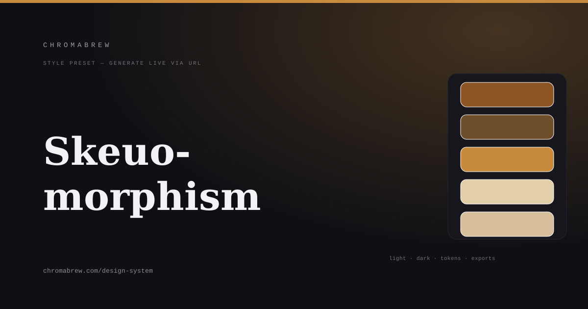
The preset builds on warm, material-believable tones: a leather tan for primary, a darker saddle brown for depth, an analogous strategy so the wood family stays in one hue neighborhood, and a rounder radius with a humanist pairing so the interface feels handled rather than machined.
Note that the generator cannot hand you texture files — wood grain and brushed-metal gradients are image work. What the preset gives you is the color physics underneath: the right temperature, the right depth of shadow, the right neutrals. When you add materials later, they only need to match the token values and the illusion stays airtight.
Tip
Materials are communicated by temperature and shadow, not by texture overload. In a generated system, let the warm palette read as the material and reserve gradient-style detailing for actual controls.
How the color roles land in this style
The warm family hardly needs separate roles to feel like materials, but the tokens still keep the UI in order: primary is the leather of the controls you press, secondary is the saddle-brown of frames and insets, accent is the brass that gleams on a toggle or a needle, and the surfaces are the polished wood the interface sits on:
:root {
  --background: #efe4d3;
  --surface: #e2cfa9;
  --primary: #8d5524;
  --secondary: #6f4e2b;
  --accent: #c88a3d;
  --foreground: #2e2114;
}
Adapt it
Swap the tan for a walnut, an espresso, or a brushed olive to change the 'material' instantly; saturation delivery keeps the warmth. The previews show where metaphor is affordable: buttons and toggles can carry dimensional treatment; paragraphs and density should stay flat and readable.
Keep the whole family in the warm half of the hue wheel. A single cool blue wandering into a wood-and-leather system reads as an imported error, and users feel it even when they can't say why. And in dark mode, resist going espresso-black for surfaces; a slightly lighter saddle-brown that still reads as wood keeps the material credible.
Related free tools
Want to apply this right now? Open the color palette generator and try it with your own brand color — free, no sign-up.